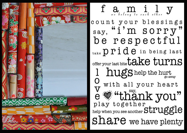
Melody outdid herself this week by DESIGNING her own wonderful family poster. What a great idea...and I believe she's got a link to download it over at her place this week, so go check it out. Mine's a bit less creative, but I do like the contrast of the colors with Melody's black and white.
Next week, we're going with DIRECTION. Should be an interesting one, so join us!


4 comments:
I think ours together looks like a card. Is that your wrapping paper? Love all those prints.
DESIGN over here, too. And the download link for the 8x10 above.
Love those bright colors. Our DESIGN is here.
For sure, the color vs b/w came out great. I love all of the designs you captured on the paper (fabric?).
C and I did Design too.
I'm loving all the patterns you captured...and the color and b&w look great together! Great designs, ladies.
Jo and I are on board with design, too.
Post a Comment